Contact Form Design: Fields, Layout, and Testing Explained
Contact form design helps prospects judge fit before they enquire. Choose fields, mobile layouts, and tracking that bring you better-fit leads.


Contents
Contact form design is the way a website’s enquiry form is structured and presented so visitors can contact a business easily. Use only useful fields, clear labels and next steps, a readable mobile-friendly layout, accessible feedback, privacy-conscious consent where applicable, and light spam protection; connect submissions to the tools that help you respond. Test changes to improve completion while filtering for enquiries that fit your services.
Think about a shop with no price tags. You’d have to ask about everything before deciding, and most people would just leave. A weak contact form does the same, leaving prospects guessing about budget and timing.
The good news is that a contact form can do the sorting for you. Ask the right questions in the right order, and every enquiry you get is one you can actually say yes to.
Here’s what we’ll cover: fields, layout, mobile, spam protection, accessibility, privacy, and testing, so you can build a form that wins better-fit clients.
The Essential Fields for Contact Form Design
Every field has to earn its place, so here’s how we’d choose yours and word them well.
Core fields and clear calls to action
Start with a name, an email, and a message. Short forms tend to generate more leads, so add fields only when you need them. Fewer fields, more replies.
- Submit button text. “Send project details” says what happens next; “Submit” doesn’t.
- Greeting and welcome message. A friendly line above the form, like “Thanks for getting in touch!”, sets the tone.
- Budget and timeline. A budget range and start date are qualifying fields that show whether a project fits your work.
A freelance illustrator kept fielding “How much?” emails until a budget range answered that up front.
If you work with clients in the European Union, the General Data Protection Regulation (GDPR) can apply. Use an unticked consent checkbox, linked to your privacy notice.
Choosing a form type for your business
- Sales inquiries. Name, email, and a short project note.
- Support requests. Ask for the project name and what went wrong.
- Order submissions. Show the price before people submit.
- Callback requests. Name, phone number, and best time to call.
- Project enquiry form for freelancers. This one filters hardest, pairing core fields with project type, budget, timeline, and a short description.
The best form asks for what it needs, not everything it could.
Writing helpful labels, errors, and hints
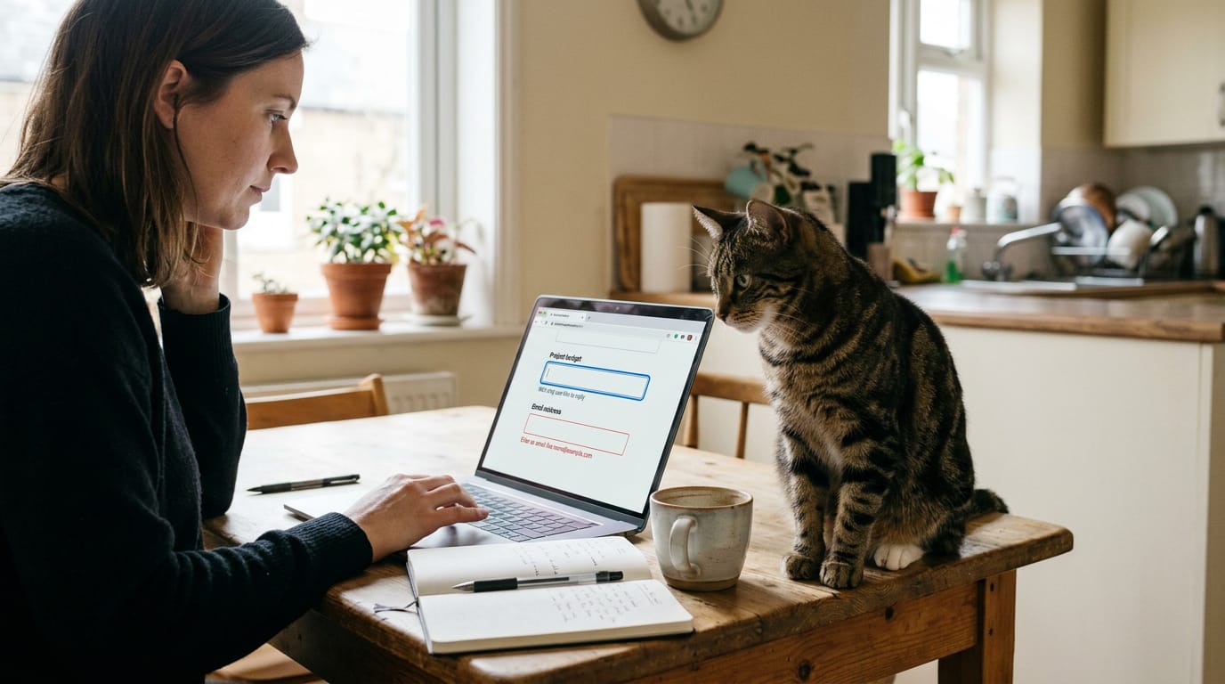
Use jargon-free labels: “Project budget” beats “Anticipated investment range.”
Keep labels visible above each field, not just placeholder text. Make the focus outline clear so people can see the active field, and check contrast between text and background.
Say what to fix: “Enter an email like name@example.com” beats “Invalid input.”
Add a hint like “We’ll only use this to reply” where people might hesitate.
Layouts, Visuals, and Ready-made Templates
Your form’s look tells visitors what kind of studio you run. Shape it on purpose so it pulls in the enquiries you want.
Templates that match your brand
Start with your site’s fonts, colors, and logo so the form feels like part of your site. Customize the editable titles and fields too: “Tell us about your project” beats a generic “Message” box.
A split image design puts the form beside a portfolio image.
A responsive template fits any screen. It’s built with HTML5 (the markup that structures the page) and CSS3 (the styling that controls layout and color). Pick one that works well on phones.
Creative layouts and backgrounds that stand out
Aim for memorable rather than busy. The form should help people fill it in, not distract them.
- Fun fonts and colors. Use a playful accent, but keep labels plain and readable.
- Animations. Keep motion subtle, and don’t let anything move while people type.
- Fullscreen designs. A fullscreen form shows one question at a time.
- Visual brand personality. Let your style carry through to the form.
- Portfolio personality. Show a few recent pieces on the form itself.
An illustrator with loose, hand-drawn work sketches her header. Anyone who enquires has already seen that style, so she gets fewer calls from clients who want something sleek.
Adding maps to help people find you
A Google Maps background shows your location while people fill in the form. An interactive delivery map marks your service area for print or physical deliveries. A clear pin makes your studio easier to discover for nearby clients.
A wedding photographer covering one city and its surrounding towns can map that area. A couple three hours away sees the mismatch before writing a paragraph. Fewer wasted emails for both of you.
Designs built for your specific industry
- Layout references. Study how Stripe’s sales form and Zendesk’s horizontal options (choices side by side, not stacked) are built, then borrow the structure.
- E-commerce credibility cues. If you sell prints or licenses online, add a clear returns policy and your full business name near the form.
- Social proof. A few client quotes near the form give hesitant visitors a reason to trust you. Use only quotes you have permission to share.

Making Forms Easier to Finish on Mobile
Most of your enquiries will come from a phone, so your form has to work there first.
Form formats that suit small screens
A form on a phone competes with the rest of the page, so the format matters:
- Pop-up forms cover the page content. They grab attention, but give them an easy-to-tap close button so the visitor isn’t trapped.
- Slide-in forms arrive from the edge of the screen and take up less room, so visitors can keep scrolling.
- Vertical layouts stack one field above the next, full width. Side-by-side fields look tidy on a laptop but squeeze text on a phone.
- One-handed navigation keeps key controls within thumb reach, usually near the bottom of the screen. A close button in the top corner is a hard reach.
Think of a wedding photographer who gets most enquiries from a phone, often while a couple is scrolling on the couch. A stacked, one-column form with one send button gets finished in a minute. A cramped two-column version with tiny boxes gets closed.
Button size, font, and placement tips
Responsive design rearranges the layout to suit the screen’s width. The goal is a form that adapts to a phone, not one that shrinks onto it.
- Font size should be readable without zooming. Tiny labels and faint placeholder text are the first things people miss on a phone.
- Touch target size is the tappable area of each field and button. Make it big enough for a thumb. Thumbs don’t do precision.
- Button placement matters too. Put one full-width submit button at the bottom, labeled with what happens next, like “Send my enquiry” instead of “Submit.”.
Features That Help More Visitors Submit
These features help more visitors finish and make every enquiry easier to act on.
Typing suggestions and instant error checks
Typing suggestions offer likely answers as visitors type, saving time and typos. Inline validation checks each field as it’s filled in.
UX Planet’s article on form assistance explains that real-time inline validation “immediately informs users about the correctness of provided data,” so errors surface while people type, not after they press send.
Visual error feedback puts each message beside its field, in plain words: “Check your phone number” beats “Invalid input.”
Picture an illustrator whose replies kept bouncing because a lead mistyped their email. Inline checks catch that on the spot, which means more accurate data.
Breaking a form into easy steps
Short steps feel manageable. Use predetermined options like dropdowns for project type and budget range, so people pick instead of type.
Consider a wedding photographer tired of “how much?” emails. Asking for the event date and budget in step one means enquiries arrive already fitting her calendar and prices.
The BrokerNotes conversion lift is a good reason to test steps on your own form. End on a confirmation page that says what happens next, then send a follow-up email.
Ways to block spam submissions
Spam buries real enquiries, so consider these:
- CAPTCHA (Completely Automated Public Turing test to tell Computers and Humans Apart): a test that asks visitors to prove they’re human.
- Honeypot hidden fields: a field hidden from people but readable by bots, which tend to fill it in. A filled-in field usually means spam.
- reCAPTCHA: a popular service in the same family as CAPTCHA.
Start light. Add more only if spam gets through.

Connect Your Tools and Track Results
A form on its own isn’t the whole job. Here’s how to connect it, route each enquiry, and see what’s working.
Using forms with WordPress, Joomla, and Drupal
If your site runs on WordPress, Joomla, or Drupal, a plugin is usually the simplest route: an add-on you install. Contact Form 7 is one WordPress option. Custom code gives full control, but every change costs you time and money.
Either way, aim for a streamlined workflow, with every enquiry landing in one place.
Sending leads to CRM and email tools
Once a submission arrives, send it to a CRM (customer relationship management system, your running contact list). MailerLite and ActiveCampaign can handle much of the follow-up:
- Automated responses. Confirm receipt the moment someone submits.
- Lead segmentation. Group leads by project type or budget.
- Lead management. Track each lead from first contact to booked.
- Auto-send proposal or booking link. Qualified leads get one without waiting on you.
Consider an illustrator who gets a book cover enquiry at 9 p.m. The booking link goes out that night, so the client books a call before the illustrator wakes up.
Tracking submissions and testing improvements
Google Analytics shows how many visitors reach your contact page, and Hotjar and Crazy Egg reveal how visitors interact with it. Traffic counts arrivals, but behavior tells you who actually finishes.
A/B testing shows two form versions to different visitors and compares completed submissions. Change one thing at a time, like the number of fields, so you know what made the difference.
A photographer sees visitors quit at the budget question, so they test a version that asks it last. They keep whichever brings in more enquiries that fit their rates. Measure it, then decide.
A contact form may not be the flashiest part of your site, but it’s often the most important. Get the fields, layout, and mobile experience right, protect it from spam without punishing real people, and add accessibility, privacy, and testing.
Your form is already filtering enquiries, so make it do that on purpose.
Every enquiry should be one you’re glad to see. Build it with care, and the right clients will know exactly how to reach you.
References
- Designing More Efficient Forms: Assistance and Validation — uxplanet.org