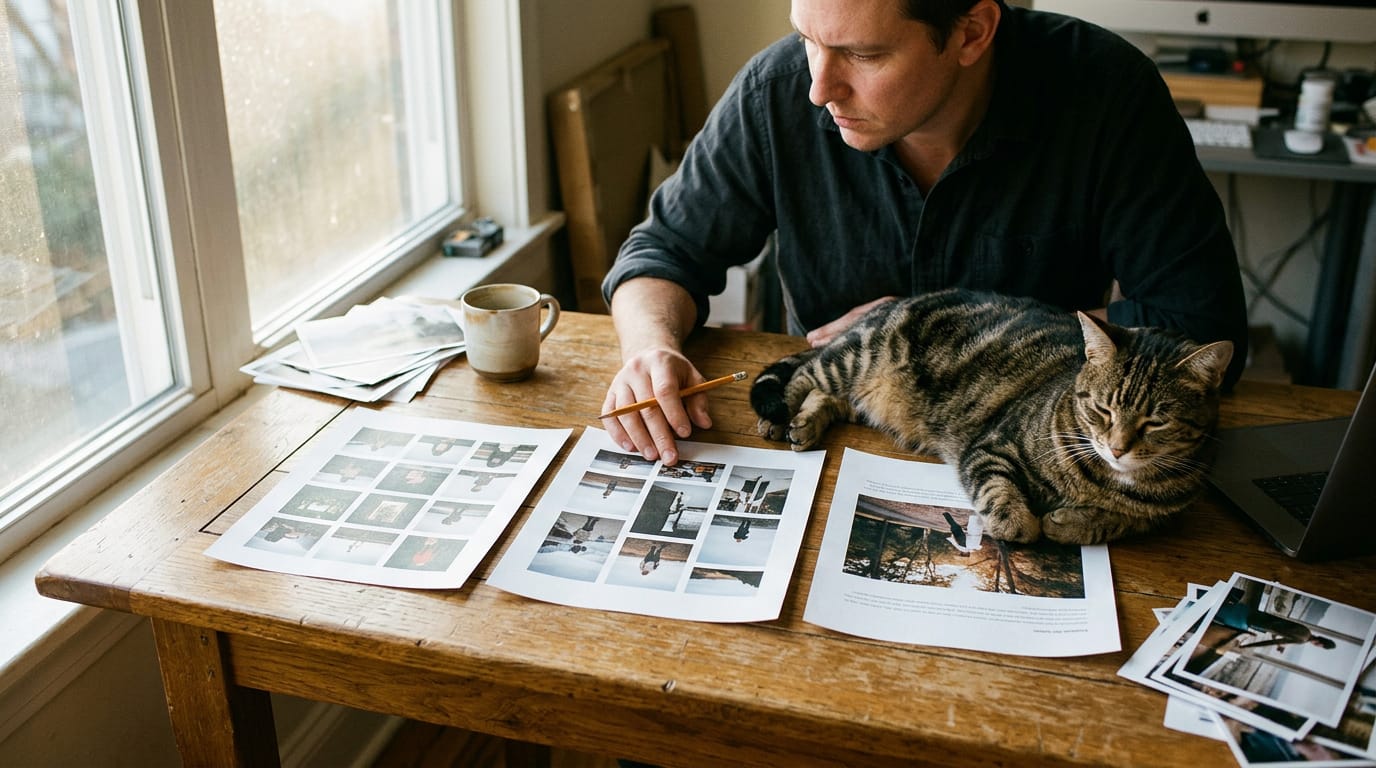
Website Layout Design: A Complete Guide to Arranging Pages
Website layout design guides where visitors look and what they do next. See how grids and scan patterns shape clear portfolio and service pages.
Contents
Website layout design is the way headings, images, text, and buttons are arranged to help visitors understand a page and choose what to do next. Use clear sections, consistent alignment, readable spacing, and a visible call to action, choosing a layout that fits the page’s purpose and works on phones. A well-planned, tested layout helps people find information, understand your offer, and take the next step without hunting.
Picture a shop where the shelves make sense and the checkout is right where you expected it. You barely notice the arrangement, but it’s why you stayed. Your website works the same way.
Website layout design is how you arrange headings, images, text, and buttons so visitors know where to look and what to do next.
In this post, we’ll cover the parts every layout needs, how grids and reading patterns shape what people notice, the layouts that work best, and how to plan and test your pages. We’ll finish with portfolio and service-page layouts that win clients.
Why Website Layout Design Matters to Visitors
Layout decides what visitors see first, how they move through your site, and whether they take the next step.
How layout organizes content and guides people
Good layout is less about decorating a page and more about directing the reader. Grouping related work into labeled sections helps people find what they came for, and a clear call to action (your one next step) shows them where to go.
Design for the people who’ll use it. A busy art director on a phone needs your pricing near the top, not a full-screen animation.
Visitors expect familiar patterns, like a logo at the top and easy-to-find contact details, so they don’t have to hunt. Predictable beats clever.
How layout shapes sales and first impressions
Layout affects sales too. A service page that leads with your outcome and ends with one clear call to action gives visitors a reason to reach out.
First impressions happen fast. According to The Engagement of Website Initial Aesthetic Impressions, website layout contributes to first impressions and can affect engagement and retention.
Layout reinforces your brand identity, too. Think of a photographer whose portfolio and booking page share one grid, so the whole site reads as one studio’s work.
Search engines read structure, too. The Document Object Model (DOM) is the page’s underlying tree of elements, like a family tree.
According to a Search Engine Land article on how the DOM affects crawling, layout and structure can affect how search engines crawl and understand a site.
When visitors can scan a page and spot the next step, they’ll keep going. Confusion loses them fast.
The Main Parts Every Layout Needs
Every page uses the same few parts. Here’s how they fit.
Common page parts like headers and menus
- Header and hero: The header holds your logo, and the hero is the large band below it for your main message.
- Navigation menu: The links that move people around your site.
- Content area: The main space for your work, text, and details.
- Sidebar: An optional narrow column for contact details, booking links, or testimonials.
- Footer: The bottom strip for email, legal links, and social profiles.
A freelance illustrator’s hero might show her best piece with one ‘View my work’ button, so an art director sees her strongest work right away.
Using a grid to line things up
A grid is an invisible set of columns (vertical strips) and rows (horizontal bands) that keeps everything aligned. Gutters are the gaps between columns that keep text and images from crowding.
A grid is less about boxing everything in and more about consistency. Shared left edges, like headlines and photos that line up, form your alignment framework.
Grids began in print, long before websites existed, and the same logic keeps screens easy to read.
Once the grid is set, you’re free to break it, but only on purpose. A full-width photo running past the margins adds drama. Overdo it, and nothing stands out.
What visitors see before scrolling
The above the fold area is everything visible before anyone scrolls.
- Essentials: Your name, what you do, and a work sample belong on that first screen.
- Scrolling cues: A sliver of the next section peeking from the bottom invites scrolling.
- Visible calls to action: Put a ‘Request a quote’ button on that first screen so clients never hunt for how to hire you.
Design Principles That Shape What People Notice
Every layout decides what visitors notice first. These principles help you choose on purpose, so your best work doesn’t get lost.
Ranking elements so the key ones stand out
Start with visual hierarchy, the order your eye follows. Five levers control it:
- Size and scale. Bigger elements get read first. Scale signals what matters most.
- Color and contrast. A bold button on a quiet background pulls the eye.
- Typography. Larger headings let visitors skim.
- Element placement. Content near the top and left usually gets seen first.
- Spacing and grouping. Items placed close together look related.
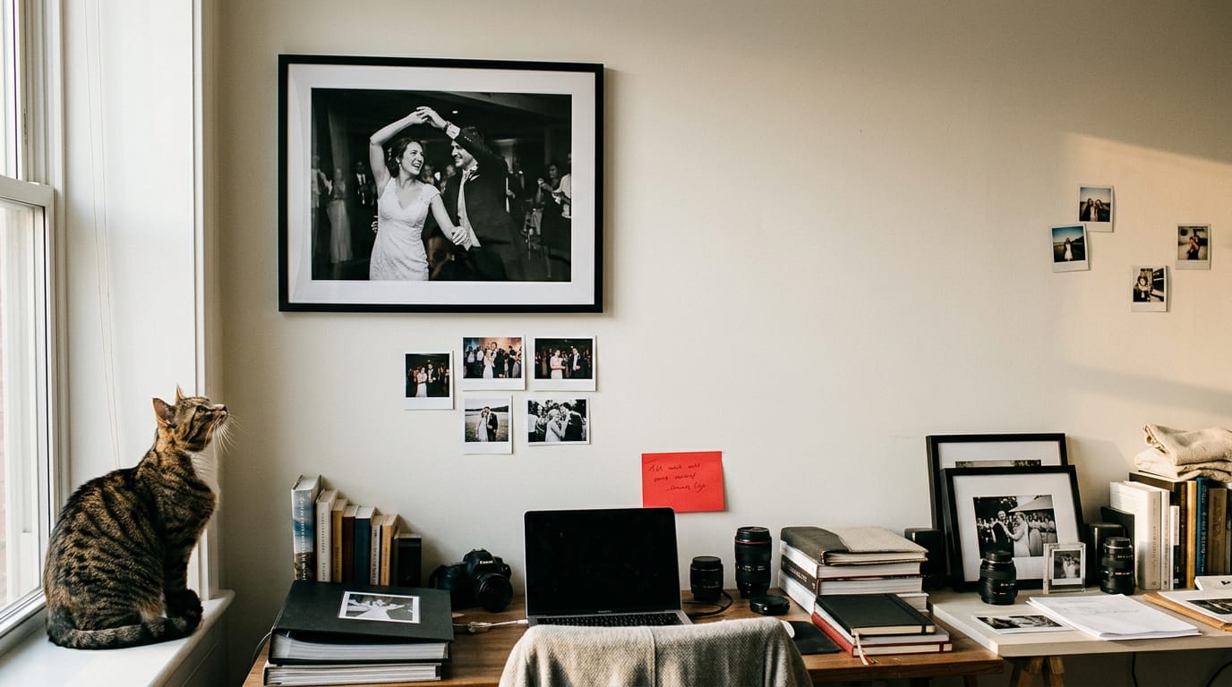
Think of a wedding photographer whose homepage leads with one full-width image and a single ‘Check availability’ button. Interested couples can book without hunting.
Using empty space to improve readability
White space, the empty area around content, gives the eye room to rest. Margins sit outside an element, padding inside it. Generous padding makes buttons easier to tap.
Empty space isolates your call to action (CTA), the button that asks for the next step, so the buyer sees one clear choice.
Less is more. Removing a cluttered sidebar often does more for a page than adding a banner.
Balance and contrast through repetition and grouping
Balance describes how weight spreads across a page:
- Symmetry mirrors elements across a center line.
- Asymmetry balances unequal elements, like a big photo beside a text block.
- Radial balance arranges elements around one focal point.
Repetition builds trust through familiarity rather than flash, so reuse the same heading and button style everywhere.
Group related items, like a project’s photo and summary, so they read as one unit.
A freelance writer’s clips sit in identical cards, so a hiring manager compares twelve samples in seconds.
Choosing colors, fonts, and images that fit
Color psychology holds that warm tones often feel energetic and cool blues calm, but that’s just a starting point. Pick one main color, one accent for buttons, and neutrals.
Choose one or two readable fonts and keep body text big enough for phones.
Use optimized images, compressed for the web, so your work looks sharp without slowing pages.
Match your brand and logo. A designer whose logo is hand-drawn should carry that hand-drawn feel into headers and buttons, so the site feels like the same studio.
How People Scan and Read Web Pages
Most visitors skim first, so the layout decides how fast they find what they came for.
Reading in an F-shape on text pages
Text-heavy pages usually get read in an F-shape: a sweep across the top, a shorter sweep lower down, then a quick scan down the left edge.
It’s less about how much text you have and more about where the eye starts, which is why the upper-left corner is prime real estate for your headline.
Blogs and news follow the same path. For example, a freelance writer’s post with a clear headline and short subheads lets readers skim the left column and still get the point.
Scanning in a Z on sales pages
Sales and landing pages usually get scanned in a Z-pattern, and each stroke has a job:
- Header: logo top left, one clear button top right.
- Diagonal: the hero image and headline sweeping toward the left.
- Bottom call to action (CTA): your main action at the bottom right, where the Z ends.
Product-focused sites follow the same route. An illustrator selling prints might put the hero image on the diagonal and the “Add to cart” button at the bottom right.
The Z works best on simpler pages, so cut anything that doesn’t serve the one action. Clutter breaks the stroke.
Placing key elements where grid lines cross
Split your screen into a 3x3 grid, the same rule of thirds photographers use for framing. The points where the lines cross are intersection hot-zones, where the eye tends to settle, not the middle of the page.
Place CTAs at intersections. For example, a wedding photographer can put “Check availability” at the lower-right crossing, where the eye lands right after the portfolio image above. Put the action where the lines meet.
Layout Types People Use Most Often
Choosing layout by site goal comes first: a page built to win one booking needs a different structure than one showing a body of work. Here’s how we’d sort them.
When single or multi-column layouts work best
A single column is the default for content like blog posts and about pages. Two columns suit side-by-side comparison, like an illustrator’s sketch commissions beside finished work.
Multi-column magazine style suits busy editorial sites, but it asks more of the reader. Design the mobile-friendly single column first, since multi-column layouts stack on phones.
Using a split screen for two purposes
Two parts, two purposes: a split screen puts the message on one side and the action on the other. A photographer’s booking page, for example, might pair a portfolio image with an inquiry form, so the work and the booking form share one view.
It suits call-to-action (CTA) pages and registrations, and comparisons too, like a fixed-price package beside a monthly retainer. The catch is mobile. On narrow screens, the halves shrink and drift apart, so stack them on phones.
Showing items in cards and grids
A card is a small, repeatable box: an image, a title, and a line of text. Lined up in rows, cards form a grid:
- Product and content cards: shop items and blog posts share one box.
- Comparing multiple items: rows of cards make packages easy to weigh side by side.
- Stores, galleries, and portfolios: grids suit anything visitors browse.
Portfolio grids matter most for freelancers: each project thumbnail opens a case study covering the problem, the work, and the result. A wedding photographer’s case studies let couples see the photos and how the day came together.
Bold, uneven layouts that break the grid
A layout that breaks the grid uses mismatched sizes, overlaps, and asymmetry on purpose. The difference between intentional and accidental is whether each choice guides the eye.
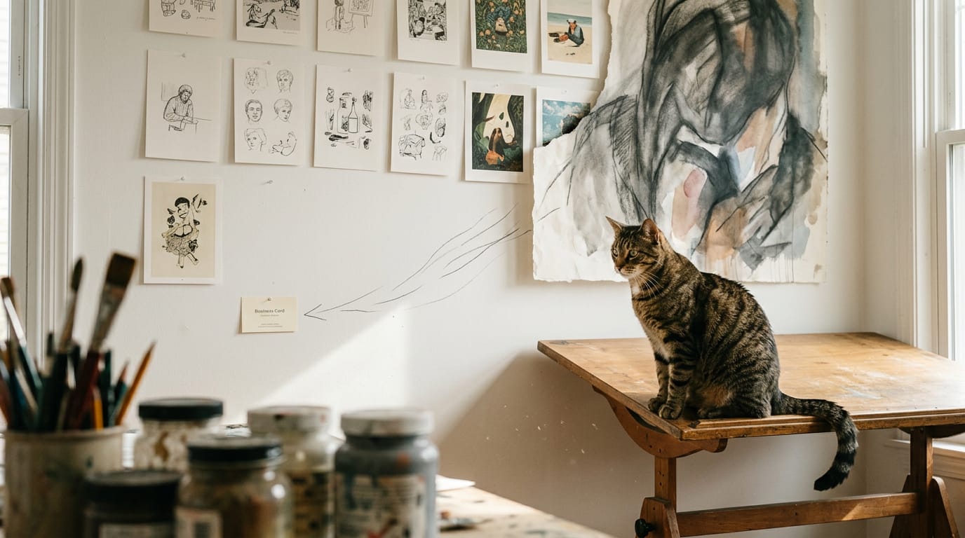
That’s why uneven but intentional layouts suit creative portfolios and fashion sites: personality is the product. An illustrator might let one big piece bleed off the edge, so the page feels like a sketchbook.
Clutter is the risk, so pick one place to break the rules. Many freelance sites look alike, so one bold move helps you stand out from competitors, as long as the contact button stays easy to find.
Big hero images and one-page scrolling sites
A hero image is the large banner photo at the top of a page, setting the mood before anyone reads a word. For one action, one photo and one call-to-action button do the job.
A food photographer’s homepage might show one hero shot and one “Book a shoot” button, so visitors know the next step.
A single-page scrolling story runs the whole site down one long page, like chapters in a book. Long pages can bury information, so keep sections tight and repeat the call-to-action at natural breaks. Length is a cost, not a feature.
Less common layout styles to consider
- Fixed sidebar navigation: the menu stays put while you scroll, handy for long case studies but cramped on phones.
- Parallax scrolling: background and foreground move at different speeds, best saved for one showpiece page.
- Minimalist layouts: generous white space and one clear focus per screen, ideal when the work should speak first.
- Modular and block layouts: pages built from interchangeable blocks you can rearrange later without starting over.
- Full-screen layouts: each section fills the screen, one idea at a time. Striking for a short portfolio, tiring across a whole site.
How to Plan Your Website Layout Design
Decide what visitors should do before you open a design tool. Planning now saves you from rebuilding later.
Mapping the user journey and site structure
Map the journey before the pages. Use card sorting, where people group your page names into categories that make sense to them, to set your menu labels.
Plan navigation with a short top-level menu, and aim for the fewest clicks to goal, so booking a call is only a few steps from the homepage.
Picking the layout that fits your page
Pick the layout once you’ve defined the page purpose (a services page sells one offer, while a portfolio proves your skill) and the page type. Then test variations with two or three quick options.
A services page can follow this order:
- A headline naming the service and its client
- What’s included, in plain terms
- Pricing or a starting-at figure, if you share one
- A testimonial and one clear call to action
Your homepage needs three sections:
- work
- services
- contact
Picture a freelance illustrator whose homepage is only a wall of thumbnails with no way to hire her. A services summary and contact button near the top fix that. Show where to click, not everything you’ve ever made.
Sketching wireframes and clickable prototypes
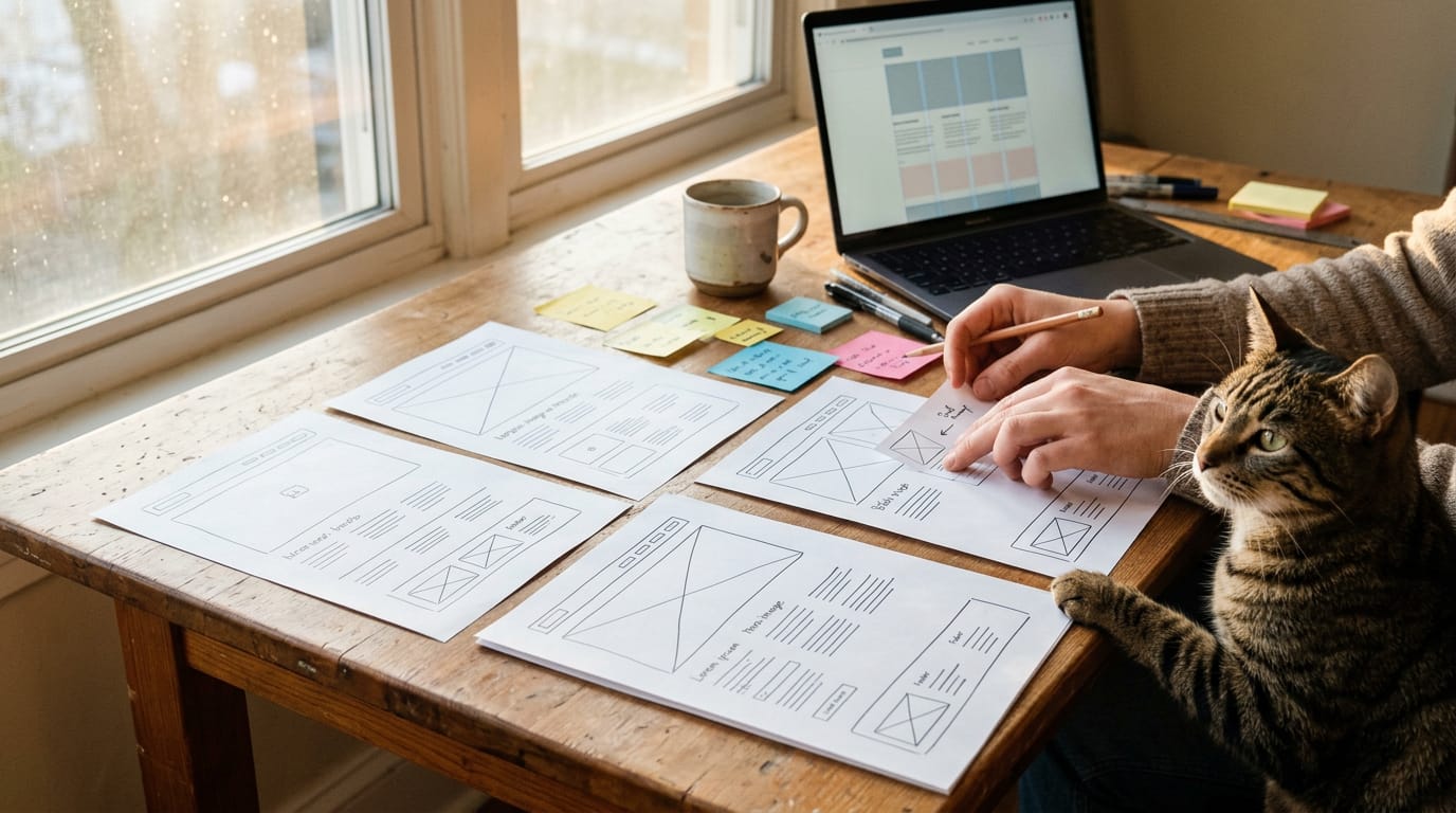
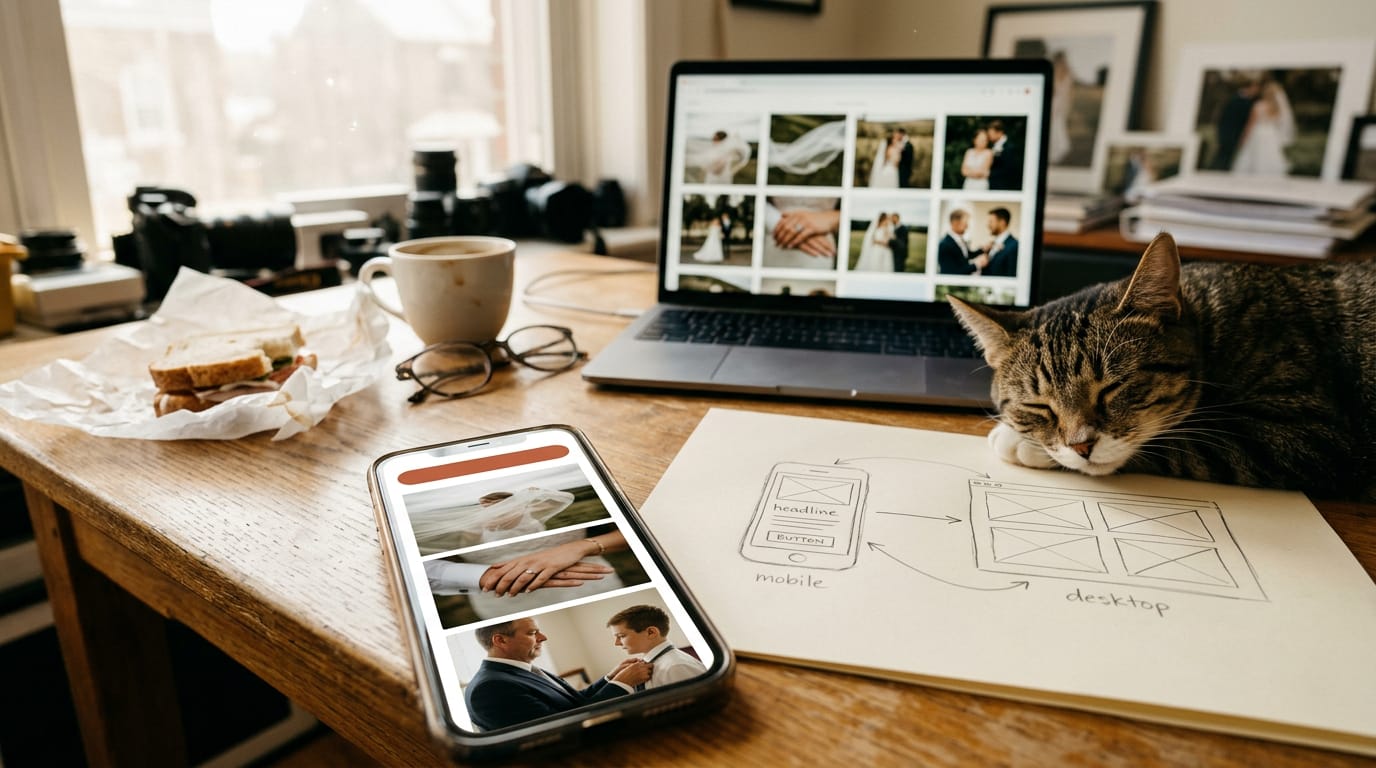
A wireframe is a page’s blueprint: simple boxes showing where headlines, images, and buttons go, with no colors or fonts yet. Sketch on paper or digitally, whichever you’ll actually finish.
Work mobile-first, designing the phone version first, since small screens force you to prioritize.
Next, build an interactive prototype, a clickable mockup, and ask a few people to find your contact form. Their user feedback shows what to fix. Settle the layout before colors and fonts, since moving sections is harder than recoloring.
Squarespace starts from templates you can rearrange, Webflow gives precise control over grids and spacing, and Framer handles the prototype and live site together.
Build accessibility in from the start: keep text contrast high and buttons big enough to tap on a phone.
Testing and improving your layout over time
Review heatmaps, which show where visitors click and scroll, and session recordings, replays of individual visits. Run an A/B test, showing two versions of a page to different visitors, and change one thing at a time.
Make usability testing ongoing by watching a real person complete one task, like booking a call. Your layout is never truly finished.
Designing Layouts That Adapt to Any Screen
Your layout has to work on a phone as well as a laptop. Here’s how to plan for every size without building a separate site for each one.
Starting mobile-first and adapting to screens
According to StatCounter Global Stats, mobile devices accounted for 60.05% of worldwide web page views in October 2026. Mobile is the majority, not the edge case.
Mobile-first design means sketching the smallest layout first: one column, clear headings, and your main call to action up top. Then you add space and columns as the screen grows, rather than cutting a wide desktop layout down.
Layouts shift through media queries, rules written in Cascading Style Sheets (CSS), the code that controls how a page looks. Each one says, in effect, ‘when the screen is this wide, use this arrangement.’
A wedding photographer’s four-across portfolio grid, for example, becomes one column on a phone, so a couple scrolling on their lunch break sees every shot and finds the inquiry button.
Adapting also means ordering content for a single column. Whatever sits at the top of a stacked layout is the first thing a phone visitor sees, so put your strongest work and contact button there.
Richer layouts cost speed. Big hero images, long galleries, and extra columns add weight, and heavy pages load slowly on a shaky mobile connection.
Keep the one image that sells the work at full quality, compress the rest, and serve smaller files on phones where your builder allows it. Slow pages lose clients.
Prompts That Tell Visitors What to Do
Visitors rarely act on a page that doesn’t say what to do next, and a well-placed button is usually the fix. Here’s how to make yours easy to spot and easy to use.
Making buttons easy to spot and click
Work through these habits:
- Look clickable. Give buttons a solid fill, generous padding, and a color that stands out from everything around them, so visitors can spot the clickable parts at a glance. Plain underlined text reads as a label, not a button. Make it obvious.
- Use action-oriented labels. Label the button with the outcome rather than the action. “Book a discovery call” tells visitors what they’ll get, while “Submit” or “Click here” tells them nothing.
- Highlight your primary call to action (CTA). This is the one thing you most want visitors to do. Give it the strongest color on the page, and keep secondary links quieter so they don’t compete with it.
- Place it above the fold. The fold is the bottom edge of the screen before anyone scrolls. Put your main CTA where it shows without scrolling, then repeat it further down.
- Put a CTA on every page. Even a gallery or a blog post should point somewhere. Think of a photographer whose portfolio ends in a dead end: one “Book a session” button at the bottom gives a happy browser a clear next step.
- Use an inquiry CTA for booking clients. If clients hire you through a form, have the button open that form directly. An illustrator taking commission requests, for instance, can ask only for what they need to reply: name, email, project type, and deadline.
Real Sites That Show Layout in Action
The fastest way to sharpen your layout instincts is to study pages that already work. Use the examples below as a field guide.
Well-known brands and sites to study
Open each site on a desktop, then on a phone, and ask one question: what is this page asking me to do first? Here’s what to look for in each group:
- Mailchimp, Apple, and Dropbox: Check how much room the headline and main call to action get before any detail appears, and whether the rest of the page earns its scroll.
- YouTube, Wired, and Shopify: Watch how each layout arranges many items, like videos, articles, or products, in a grid, and note where your eye lands first.
- The New York Times, CNN, and The Washington Post: Packed news layouts where many stories compete for attention. Count the levels of emphasis each page uses to signal what matters most.
- Squarespace template demos: Treat these as ready-made layouts. Click through a few and note which blocks, like a large top banner or a row of three features, show up again and again.
- Solo creative portfolio layouts: Look for portfolios from illustrators, photographers, and designers who run a studio of one.
Consider a freelance photographer whose portfolio opens on one full-width shoot instead of a crowded grid of thumbnails. An art director who lands there sees the work before any menu, and the payoff is a shorter path from browsing to an inquiry.
Study each site for how it guides the eye rather than what it looks like. Visual hierarchy, the order in which a page pulls your attention, is the skill you’re really borrowing. Work first, menu second.
A good layout doesn’t shout. It quietly guides visitors from the first glance to the moment they reach out. Start with clear parts, a sensible grid, and a reading path that matches how people scan.
Then test your pages on real screens and adjust what gets ignored.
Every choice you make, from where a headline sits to how your projects are grouped, either helps a visitor say yes or leaves them hunting for the next step. Keep it clear, keep it consistent, and let your work do the talking.
References
- The Engagement of Website Initial Aesthetic Impressions: An Experimental Investigation — doi.org (2018)
- How the DOM affects crawling, rendering, and indexing — searchengineland.com (2026)
- Mobile vs Desktop Usage Statistics 2026: StatCounter Data — statisticsglobal.org (2026)
Sources
- The Engagement of Website Initial Aesthetic Impressions: An Experimental Investigation, doi.org,
- How the DOM affects crawling, rendering, and indexing, searchengineland.com,
- Mobile vs Desktop Usage Statistics 2026: StatCounter Data, statisticsglobal.org,