Portfolio Theme Guide: Choosing a Layout That Works
A portfolio theme shapes how visitors judge your work. Compare layouts, must-have site features, and ways to match a design to your target clients and upkeep.
Contents
A portfolio theme is a ready-made design template that determines how your projects, text, and pages appear on your website. Choose a clean, easy-to-update layout that suits your work and the clients you want, then make projects easy to browse and include clear ways to contact you. The right theme keeps attention on your strongest work and helps visitors decide whether to hire you, while a manageable site is more likely to stay current.
Think of your portfolio as your studio’s front window. Visitors decide in seconds whether to walk in, and the layout does much of that deciding.
A portfolio theme is the pre-built design behind that window: the grid, fonts, spacing, and how each project is shown. The right one fades into the background. The wrong one fights you every time you add a project.
Here, we’ll look at what every site needs, the layouts worth trying, and how to match a theme to the clients you want and the admin you can actually sustain.
Why the Right Portfolio Theme Matters
A portfolio theme is the template that shapes how your work looks online, and picking one matters more than it might seem. Here’s why it counts, plus what ready-made options bring to the table.
Showing your work beats a resume
A resume tells a client where you’ve worked. A portfolio shows what you’ve made. Think of an illustrator who sends a publisher one spread that matches its style. That image says more than a page of job titles.
A wedding photographer can send one link to a prospect, and a well-organized gallery answers the questions that would otherwise fill an email thread. Let the work sell.
Plenty of freelancers offer similar skills, so presentation can set you apart. A distinct look gives your work a recognizable style before anyone reads a word.
When your portfolio highlights the work you love, you attract more of it, and that’s work you’ll enjoy getting paid for. A writer who features long-form pieces on sustainable farming is more likely to hear from editors looking for exactly that.
Perks of ready-made themes and builders
Ready-made themes and builders come with a few perks:
- Build without coding. A photographer can launch a site on a Saturday and send the link to a client that afternoon, no developer needed.
- Modern minimalist design. Clean layouts keep attention on your images and words, not on decoration.
- Lightweight, fast loading. Pages that load quickly keep visitors from giving up before they reach your best work.
- Page builder support. Many themes work with a page builder, a visual editor where you drag sections into place.
- Quick AI-built sites. Some builders use artificial intelligence (AI) to draft a starting layout, so you’re not facing a blank page.
What Every Portfolio Site Needs
Your portfolio has one job: help a stranger decide to hire you. Every element below makes that decision easier.
Show off your best projects
Show what you made, then show why it worked. Look for these features:
- Filterable gallery. Visitors click a category, like packaging or editorial, and see only that work.
- Slideshows and videos. Motion can show a logo animation or a behind-the-scenes clip.
- Project detail pages. Each project gets its own page with the brief, your process, and final pieces.
- Thumbnails linking to case studies. Each thumbnail leads to the story behind the work.
Take a food photographer with restaurant, packaging, and cookbook work. A restaurant owner clicks straight to the restaurant shoots, so the inquiry comes sooner.

Introduce yourself and let your personality shine
A short intro with a friendly photo and one plain sentence about what you do sets the tone fast.
Let your personality come through. Your bio should read more like you talking to a client than a résumé. Keep education and experience brief: just the training and roles that matter to your work.
Bringing in a subcontractor? A team page introduces them too, so clients know who’ll be on their project.
Easy ways for clients to reach you
Make hiring you the easy part. Visitors who have to hunt for an email address often leave.
- Contact form. Visitors can message you without opening their email app.
- Creative buttons. Label the main button with a clear action, like Start a project.
- Social links in footer. Put your Instagram or LinkedIn icons where visitors look last.
- Newsletter signup. It keeps in touch with people who aren’t ready to hire yet.
- Inquiry form that qualifies budget. Ask for a budget range and target date, so you’ll see fit before you reply.
Picture a freelance copywriter whose inquiry form asks for a budget range. A request far below her rates gets a polite no before it eats an afternoon.
Share expertise and boost search visibility
A guide, Improve the impact of your articles and Blogs, notes that a blog can share expertise and stories while giving visitors more content to discover through search.
Write about teaching rather than announcing. A post on rebuilding a nonprofit’s donation page gets read; one announcing a finished project gets skimmed.
Pick a theme with a ready blog template so every post gets the same clean layout. Each post is another page that can turn up in search, a new door for strangers to find you.
Build trust with reviews and case studies
Clients who’ve never met you are a little nervous. Proof beats promises.
- Client reviews. Short quotes with a first name, a role, and the client’s permission.
- Press page. Features, interviews, and mentions, if you have them.
- Client logos. Recognizable names, but only with permission.
- Case studies. A short write-up of the problem, your work, and the result.
- Case studies with client outcomes. Focus on outcomes rather than output: what changed for the client.
Sell products directly from your portfolio
Some freelancers also sell printable art, presets, or templates. Selling from your portfolio means one less site to maintain.
- WooCommerce compatibility. WooCommerce is a store plugin for WordPress sites. Check that your theme supports it.
- Sell products directly. A shop page beside your portfolio lets a fan of your lettering buy a print in one visit.
- Member area, easier checkout. Paying clients log in to find downloads, and repeat buyers check out faster.
Layout Styles and Design Ideas to Try
Your layout sets the tone before anyone reads a word, so pick one that fits the work you want to win.
Popular layouts, from grids to one-pagers
Most themes use one of these:
- Grid and masonry: even rows, or staggered tiles of mixed heights.
- Fullscreen and split-screen: one image fills the window, or a big image sits beside text.
- Carousel and card: slides of work, or preview boxes that open case studies.
- Timeline and Z-pattern: projects in date order, or a Z-shaped path for the eye.
- Asymmetrical layouts: uneven columns that feel editorial.
- One-page layouts: one long scroll with menu links that jump to sections.
An illustrator with many small spot pieces should use a grid, so clients can scan the set fast. A grid shows how much you’ve made, while a split-screen shows how well one standout piece was made. Clients scan first.
Creative techniques to make projects pop
- Interactive elements: before-and-after sliders visitors can drag.
- Project layering: a logo, a product preview, and a sketch stacked on one page.
- Visual cues and spacing: arrows and white space that show where to look.
- Process notes and captions: a two-line note on the brief or the fix.
- Lightbox galleries: a pop-up that enlarges an image over a dimmed page.
A packaging designer might add one line under each shot: ‘Brief needed a label that reads under store lighting, so we tested three finishes.’ That note shows clients how you think.
Layout ideas for your industry
Your field shapes the choice:
- Architecture, art, and modeling: fullscreen lets renders and canvas work breathe.
- Graphic design and photography: grids and lightboxes make series easy to compare.
- Filmmaker and game designer: fullscreen video and timelines show motion and build stages.
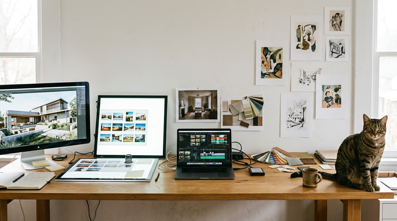
- Social media and interior design: cards suit quick posts, and split-screen pairs a room with its swatches.
- Illustration and artist themes: masonry with generous white space keeps each piece from competing.
Add motion with scroll and hover effects
- Parallax scrolling: background and foreground move at different speeds for depth.
- Hover effects: a caption fades in when the cursor passes a thumbnail.
- Scroll animations: images fade in as the reader reaches them.
- Fullscreen sliders and video: your best piece fills the screen on load.
Motion should guide the eye, not distract it. Test it on a phone.
How to Choose a Theme or Layout
Your theme makes the first impression, so it’s worth choosing carefully.
Check design quality and ease of use
- Clean, uncluttered layout. Your work should be the star.
- Strong typography. Use two or three fonts: one for headings, one for body text.
- Test flow like a client. Click through as a first-time visitor.
- Image-friendly galleries. Grids should keep your images sharp and uncropped.
- Preview with your own work. Judge how it works for visitors, not how it looks in the demo. An illustrator with tall sketches, for example, should check whether wide banners crop them before launch.
Technical must-haves for every site
- Mobile responsiveness. The layout adapts to phone screens.
- Fast load times. Slow pages lose visitors before your work appears.
- SEO-friendly markup. Search engine optimization (SEO) means clean code that search engines can read.
- Page builder compatibility. Confirm the theme works with your visual page builder plugin.
- Translation and RTL support. Translation serves other languages. RTL (right-to-left) support handles scripts that read right to left.
- Accessibility and dark mode. Accessibility keeps your site usable for screen-reader and keyboard users. Dark mode offers a darker view.
- Image optimization for heavy galleries. Sized, compressed images keep photo-heavy pages fast.
How easily you can customize it
- No-code customization. Change colors, fonts, and menus from a panel, not code.
- Reorderable sections. Drag sections into the order your clients care about most.
- Child theme for edits. A child theme holds your changes so updates don’t erase them.
- Built-in essential pages. Ready-made About, Services, and Contact pages save setup time.
- Fits your goals. Pick a layout that matches your main job, like booking calls.
Total cost covers the theme, hosting (where your site lives), and plugins, so add them up first. Lock-in is the hidden trap: switching later can mean rebuilding by hand. Plan the exit now.
Themes and Templates Worth a Look
Your theme sets the look of your portfolio, and each route below asks something different of your time and budget. Here’s how we’d sort them.
Free WordPress themes that work well
Start with Astra, Go, and OceanWP, or compare Ultra, Flexia, and Shapely. Perfect Portfolio and Twenty Twenty-One round out the list.
Don’t pick on looks alone. Check each theme’s features, its compatibility with the plugins you already use, and how it handles SEO (search engine optimization, the settings that help clients find you on Google). Judge a free theme on fit, not just price.
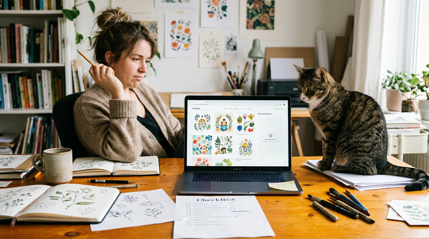
Picture an illustrator who loves a free theme’s grid, then finds her booking plugin won’t work with it. Checking first would have saved her a rebuild.
Ready-made Elementor template packs
Elementor is a WordPress plugin for designing pages visually. Template packs like EleFolio, Mellafex, CVTemple, and LyfGuide give you ready-made layouts to customize.
Their main draw is no theme dependency: the layouts aren’t tied to one theme. Just remember you’ll need Elementor and Templately running before any pack works.
A photographer can grab a pack, drop in her own images, and rearrange the sections herself instead of waiting on a developer. You’re choosing layouts rather than a finished theme, which buys control at the cost of setup time. Plan for it.
Browse a large catalog of paid themes
The paid catalog holds 130 portfolio themes priced between $39 and $89. Filter by:
- style
- layout
- plugin compatibility
so you only see themes that work with your setup. Freelancer, illustration, and artist categories narrow things further.
An illustrator selling prints might pick the illustration category, then compare layouts that show artwork largest. Use categories to find your kind of work, not just the prettiest demo.
Drag-and-drop templates from website builders
Website builders such as Wix offer profession-based templates, so you can start from a layout grouped by the kind of work you do. Everything is customizable and drag-and-drop, so you can swap in your own text, images, and sections without touching code.
Skip the blank page with an AI (artificial intelligence) website builder that drafts a first version for you to edit. Speed is the upside, but ask how easily you could move your site later.
Best Practices for Your Portfolio Content
Your portfolio sells before any call, so every piece should earn its spot.
Pick and sort your strongest projects
Aim for 6 to 10 strong projects, enough to show range without making visitors dig. Choose 3 to 5 signature pieces from them to feature first. Organize the rest by type or medium, such as logos or packaging, so people find what they came for.
Remove older work that no longer fits what you do. Say you’re a brand photographer who wants more product shoots. Lead with those and cut the older portrait sessions that pull attention elsewhere.
Show the details that build credibility
Case studies build trust faster than images alone. For each project, cover the:
- problem the client faced
- solution you created
- role on the job
Something like Redesigned a small nonprofit’s donation page, handling layout and copy solo tells a buyer more than a bare screenshot.
Credit collaborators by name, whether that’s a copywriter, developer, or art director. It’s good manners and shows future clients you work well with a team.
Show process work too: sketches, early drafts, and revisions. Buyers want to see how you think, not just what you finished.
Get written permission before you show client logos. Photograph physical pieces in good light, and use real mockups instead of generic templates.
Give your personal brand a human touch
Clients hire people as much as they hire portfolios. Lead with your strengths in one plain sentence, such as: You’ll get fast turnarounds on packaging design, with honest feedback at every step.
Let your personality shine through a short bio, a real detail about how you work, or a note about the clients you love. Keep the tone friendly and authentic rather than stiff. Warmth wins.
A portfolio theme is a tool, not a personality test. Choose one that shows your best work clearly, fits the clients you’re after, and asks only for the upkeep you can realistically give it.
Start with the work you want more of, compare two or three options side by side, and get the basics set up before chasing every customization. A site that’s easy to update is a site that gets updated, and that keeps new inquiries coming in.
The best theme is the one you’ll actually keep current.
References
- Improve the impact of your articles and Blogs: from invisibility to visibility — hdl.handle.net (2015)